

Cost Efficiency Dashboard
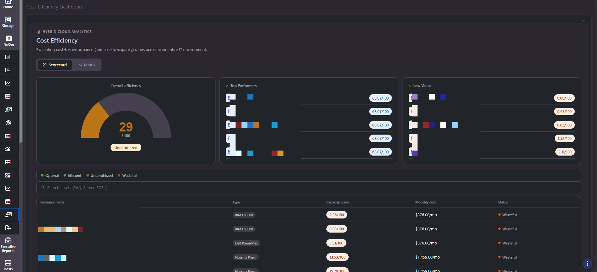
The Cost Efficiency Dashboard, filed under Hybrid Cloud Analytics, asks a different question from the rest of FinOps. Not what does this cost, and not what could we reclaim, but is this asset earning what we pay for it. Storage arrays and VMware hosts are scored on the same 0 to 100 scale and sorted into four tiers, so an aging SAN and an underloaded ESX host can be compared directly.
The four tiers
| Tier | Score range | What it usually means |
|---|---|---|
Optimal | Above 75 | Cost and utilization are well matched |
Efficient | Above 50, up to 75 | Reasonable return on the spend, some headroom |
Underutilized | Above 25, up to 50 | Capacity or performance is going unused relative to cost |
Wasteful | 25 or below | The asset costs materially more than the work it is doing |
Two views of the same data
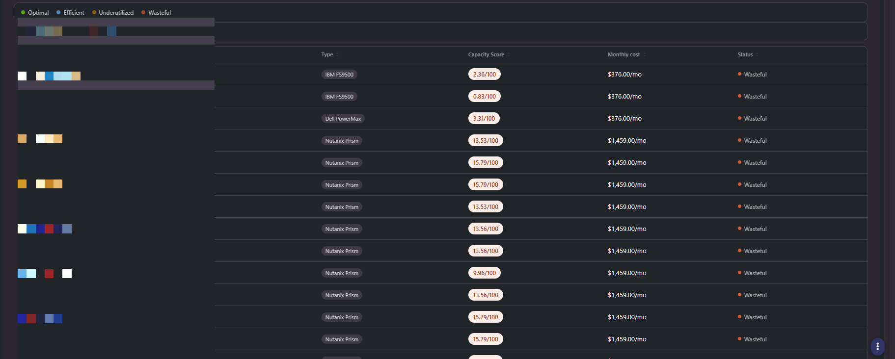
- Scorecard. An overall efficiency gauge for the environment, a Top Performers panel with the five highest-scoring assets, a Low Value panel with the five lowest, an asset search box, and a grid of every scored asset with Resource name, Type, Capacity Score, Monthly cost, and Status.
- Matrix. The same assets arranged into four horizontal tier bands, each band showing its score range and a live count. Every asset appears as a card with its score and monthly cost. Empty tiers render as a header with nothing under them, which is itself informative.
Use Scorecard when you want a ranked list and a single headline number. Use Matrix when you want the shape of the estate: how many assets sit in each band, and how much monthly cost is concentrated in the bottom two.
Interpreting a low score
Storage and compute frequently score in different ranges, and that is a property of how each type is typically provisioned rather than a verdict on the hardware. Arrays are bought with years of headroom by design, so a low capacity score on a recently purchased array is expected and will improve as it fills. Compare like with like: an array against other arrays, a host against other hosts.
A low score is a prompt to investigate, not a decision. Pair it with the underlying cost build and with the reclaimable capacity figures before concluding an asset should be consolidated or retired.
Note: Let the page finish loading before reading it. This dashboard populates progressively, and a screenshot taken mid-load can show a sparse asset list and a misleading overall score.
Scored twice: internally and globally
An asset is scored within your own organization, which is what the gauge, the tiers, and the rankings on this screen reflect. Devices are also scored comparatively against all devices reporting through Visual One, which is why the section is labelled Hybrid Cloud Analytics rather than sitting with the rest of the cost reports.
The internal score answers whether this asset is earning its keep relative to your other assets. The comparative view answers whether your estate is efficient relative to the wider population of similar hardware, which is a different question and a harder one to argue with. Combined with the FinOps assessment, it gives leadership a maturity picture that can be compared against last quarter rather than a snapshot with no baseline.
Related screens
Financial Administration exposes the capacity, performance, and cost-efficiency score fields that feed this dashboard. Savings Report quantifies what a low-scoring asset is holding in reclaimable capacity. Amortization Report tells you whether a wasteful asset is close enough to end of life that the answer is simply to let it retire.