

Amortization Report
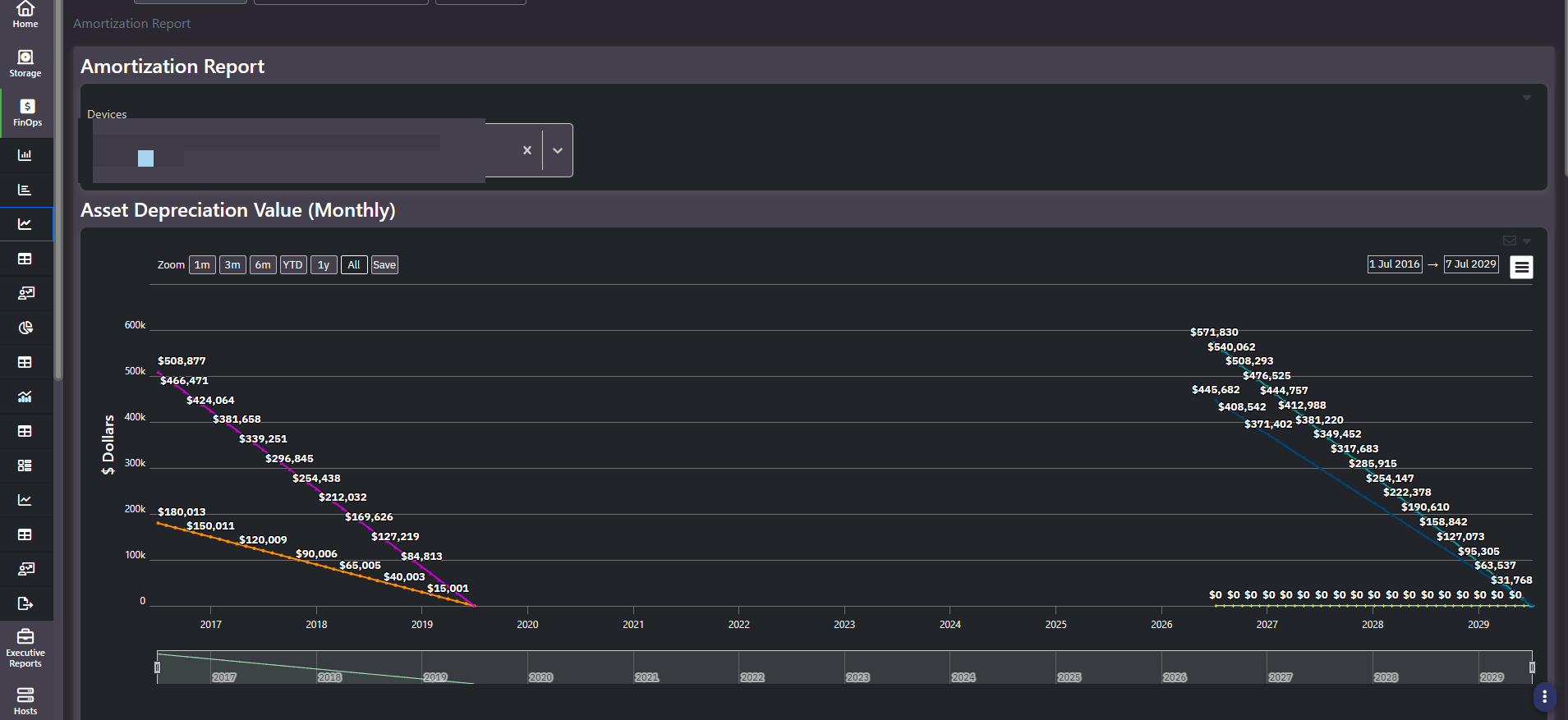
The Amortization Report tracks what your hardware is still worth. Each selected device depreciates on a straight line from its acquisition value down to zero, and the chart runs the full schedule so you can see which assets are aging off the books and when.
What this screen shows
A multi-line chart titled Asset Depreciation Value (Monthly), one line per selected device, plotted over a horizon long enough to cover a full hardware lifecycle in both directions. Each line declines linearly from its starting asset value and flattens at zero once fully depreciated. Different devices have different starting values and different slopes, so the crossing points tell you the order in which assets come off the books.
Controls
- Devices multi-select. Chips in the header, each removable. Add or remove arrays to change which lines are charted.
- Zoom presets.
1m,3m,6m,YTD,1y,All, plus explicit start and end date pickers and a Save control for the view. - Range brush. A mini selector beneath the chart for scrubbing the visible window across the full multi-year span.
The grid
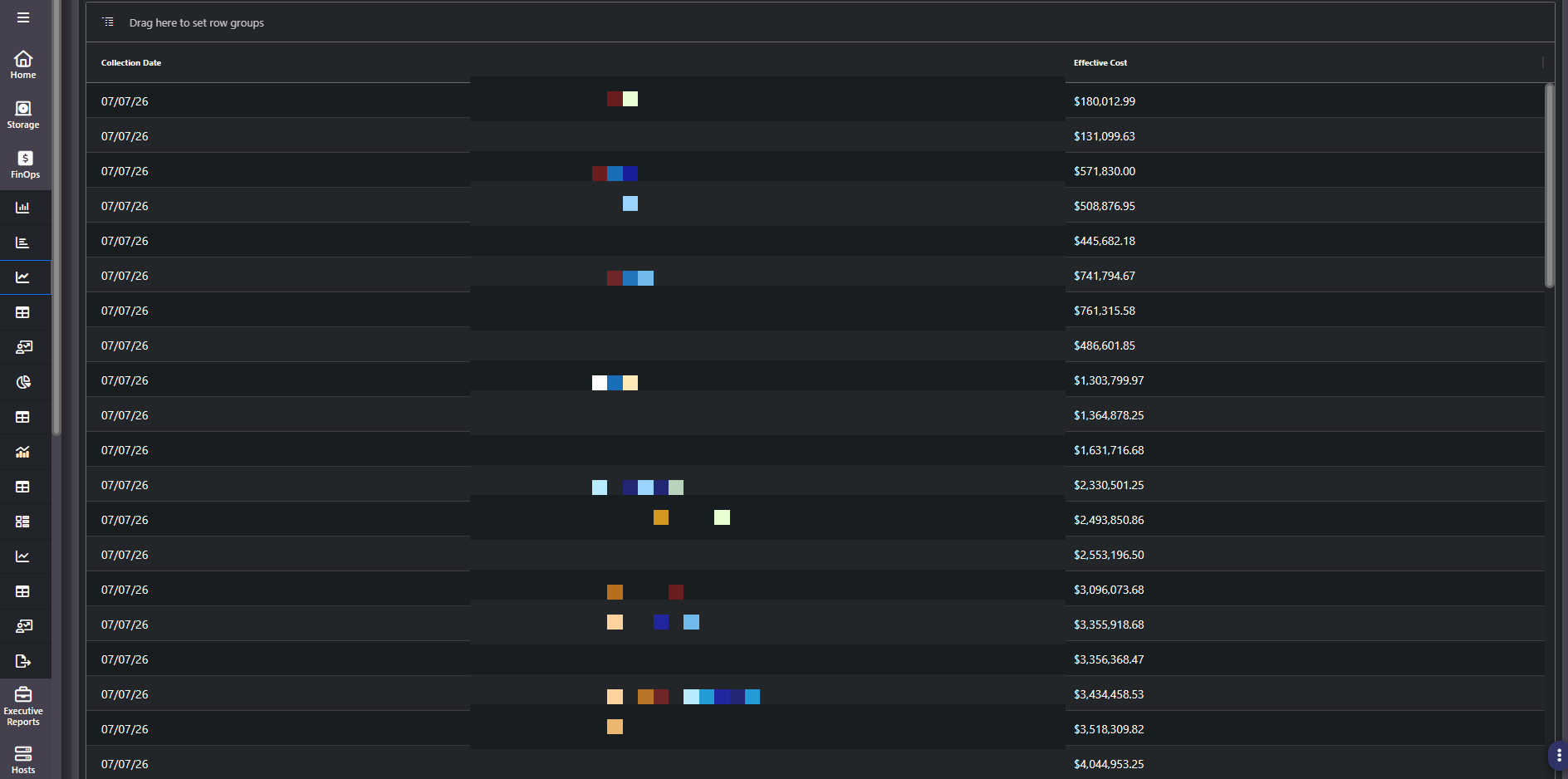
Three columns: Collection Date, Device Name, Effective Cost. Each device recurs across every historical collection date, which makes this grid a periodic snapshot ledger of effective cost per device over time rather than a single current-state table.
Note: The Devices filter scopes the chart, not the grid. The grid always shows every device with historical cost, including ones you have not charted. If a device appears in the table but not the chart, that is why.
Reading a flat line
Not every device depreciates. A subscription-licensed or appliance-based platform can carry a large, flat effective cost across every snapshot while the purchased arrays around it decline. A flat high line usually means the asset is being expensed rather than depreciated, and it should be reasoned about as recurring operating cost, not as a capital asset with remaining book value.
Why it matters
Refresh planning and capacity planning are usually run separately, by different people, on different calendars. This report is the financial half of that conversation: it tells you when an array stops carrying book value, which is often a better trigger for a refresh discussion than a capacity threshold alone.
The fixed asset schedule
Read as a whole, the chart and the historical cost ledger beneath it are a fixed asset schedule. It is reconcilable to the general ledger, and it is the artifact that makes an on-premise estate legible to an accountant rather than being a capacity story with no financial counterpart.
Where ServiceNow is integrated, the inputs behind these lines, purchase price, contract terms, and lifecycle dates, come from the IT asset management system of record. That matters for defensibility: the depreciation schedule traces back to the same asset record procurement and finance already work from.
Related screens
Financial Administration holds the purchase dates, retirement dates, and acquisition costs that drive these depreciation curves. Enterprise Capacity Plan answers the other half of a refresh decision: when the array runs out of room.