

Tag Trends
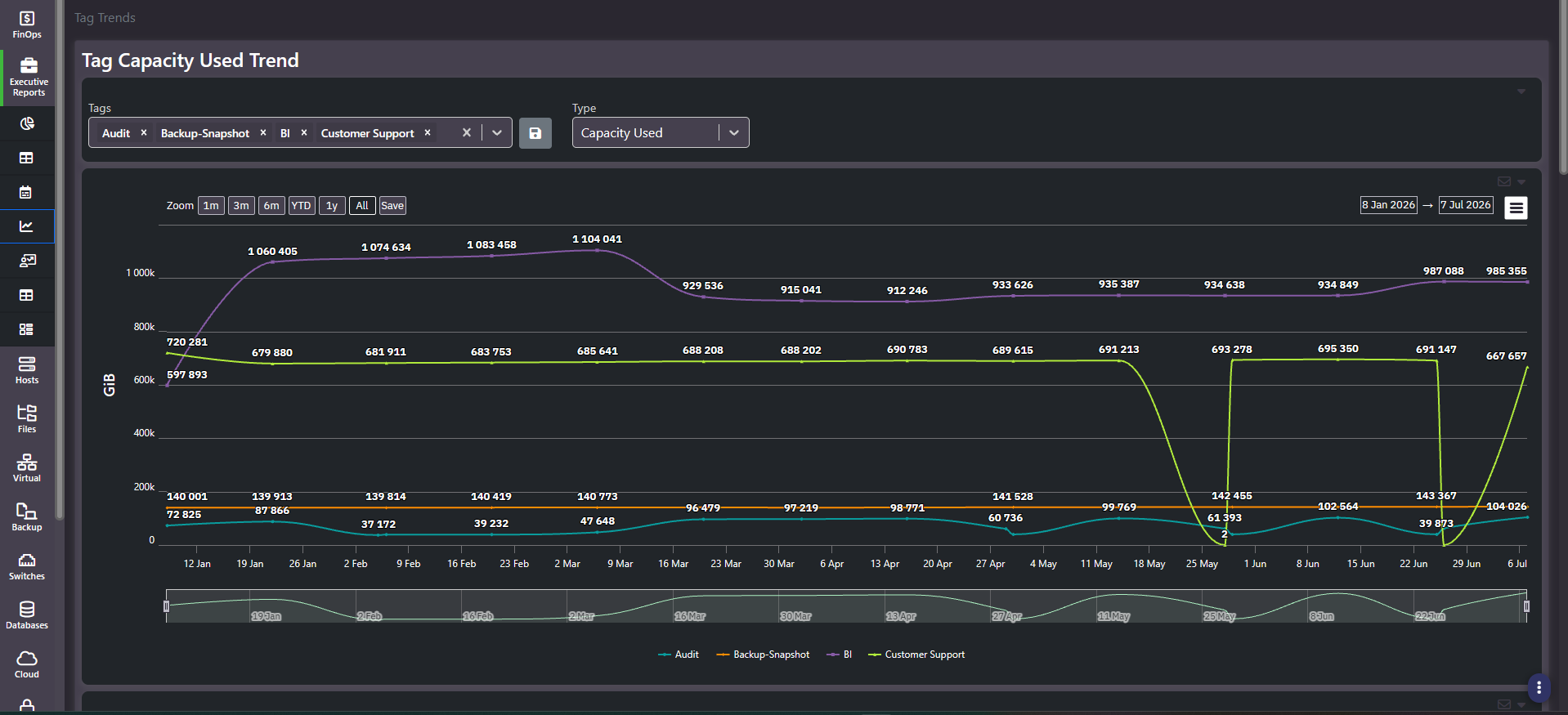
Purpose: Consumption and cost per business unit over time. Pick the tags you care about and watch them move, with the underlying figures in a grid below. This is the screen that turns chargeback from a monthly number into a trend somebody owns.
When to use it
- Show a business unit its own consumption curve rather than a single invoice figure
- Identify which units are driving estate growth, and which are flat
- Support a budget conversation with a trend instead of a snapshot
- Spot tagging or collection gaps, which show up as sharp dropouts
Key areas and metrics
- Tags multi-select. Removable chips, one per selected tag value, with a clear-all control and a save action for the selection. Only the selected tags are plotted.
- Type selector. Chooses the metric the chart plots, for example
Capacity Used. - Chart. One line per tag, y-axis in GiB, with data labels on the points, zoom presets of
1m,3m,6m,YTD,1y, andAll, explicit start and end date pickers, an export menu, and an email action. - Range brush. A miniature chart beneath the main one for scrubbing the visible window.
The grid
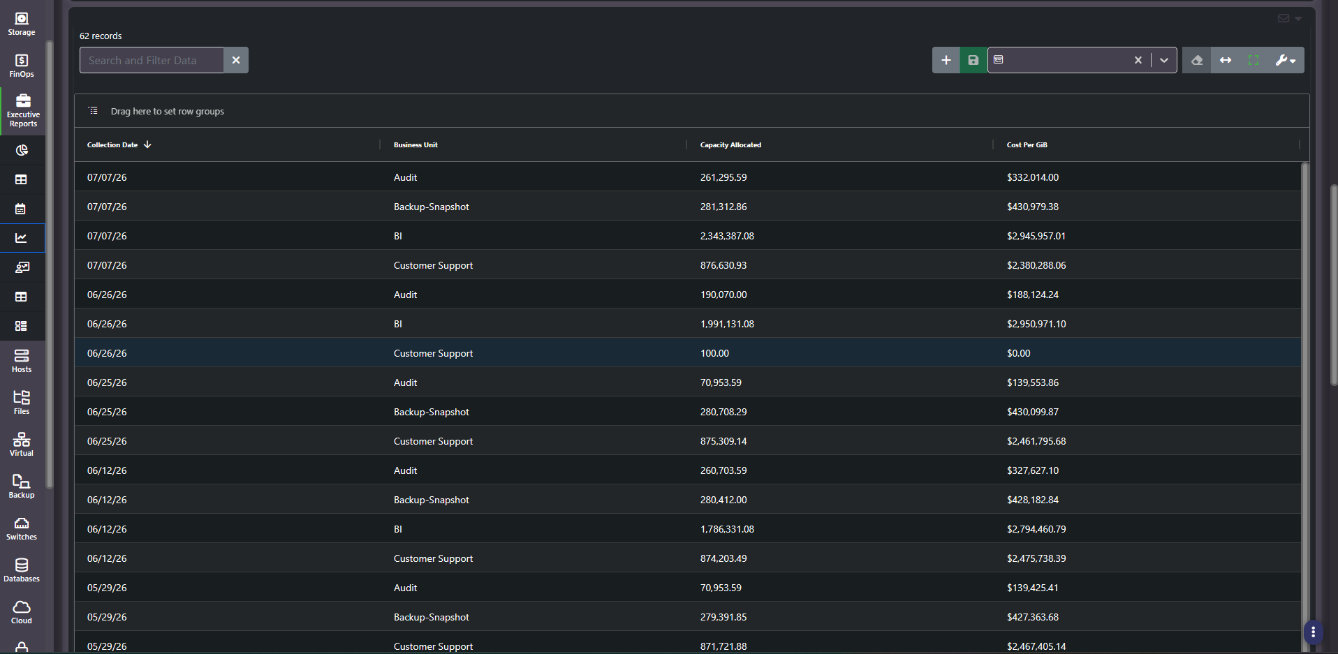
One row per tag per collection date, sorted by date descending, with columns for Collection Date, Business Unit, Capacity Allocated, and cost. Because each collection produces a row per tag, the record count grows with both the number of tags selected and the length of the window.
Note that the chart plots capacity used while the grid reports capacity allocated. Those are different measures, and on a thin-provisioned estate they diverge substantially. Do not read a grid figure as the value behind a chart point.
Reading a dropout
A line that falls vertically to near zero and recovers a few days later is almost never a real capacity event. It is a collection that failed, or a tag that briefly stopped being applied. The grid confirms it: the corresponding row shows a token capacity figure and zero cost, which no live workload would produce.
This matters because these charts get presented. A dropout left unexplained in a business-unit review reads as either a data problem or a service outage, and neither is the conversation you wanted.
Common actions
- Select two or three tags, not all of them. The chart is a comparison tool. A dozen lines is a picture of nothing.
- Save the selection. The save control preserves a tag set so the same review runs identically each month.
- Use YTD for budget conversations and 1y for capacity ones. Year to date matches the finance calendar; a full year exposes seasonality.
- Sort the grid by capacity to find the largest consumers within the selected window.
Tips
Check for dropouts before exporting. One vertical cliff in a line will attract more questions in a review than the trend you came to present.
Related screens
Tag Cost Inventory ranks tags by current spend. Tag Summary lists the individual resources behind a tag. Tag Forecasting projects a single tag forward. All Tags is where tagging gaps get fixed.