

Cost YTD Report
The Cost YTD Report is the year-to-date picture: what you have spent so far, where it went, and how the monthly run rate is moving. It is the report to open when someone asks how the year is tracking.
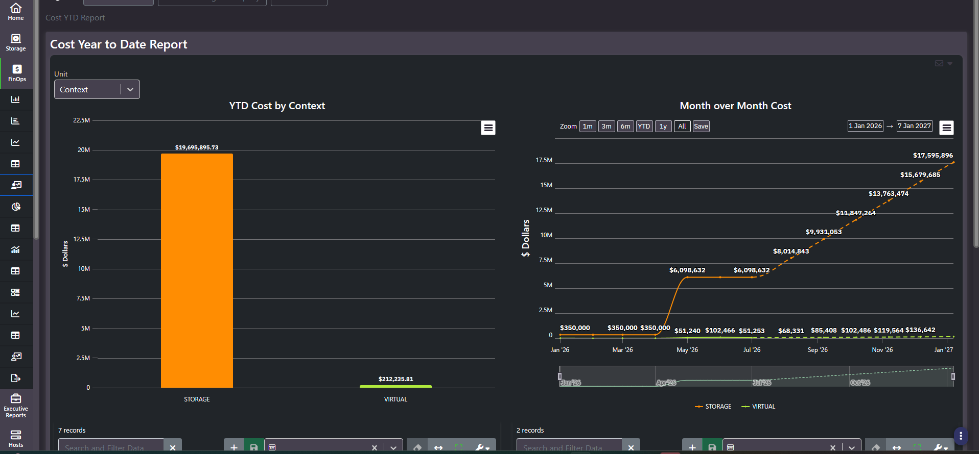
What this screen shows
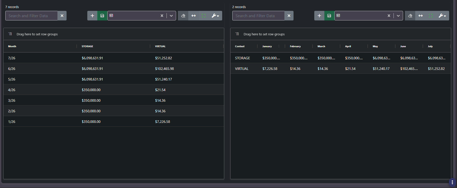
Two charts side by side and two grids beneath them. On the left, a bar chart of year-to-date cost with one bar per grouping. On the right, a multi-line month-over-month chart with one line per grouping, carrying the usual zoom presets, explicit date pickers, and a range brush. The two grids present the same dataset transposed: one with months as rows and groupings as columns, one with groupings as rows and months as columns, so you can pick whichever orientation suits the analysis instead of exporting and pivoting.
The Unit toggle
One header dropdown re-dimensions the entire report. This is the most important control on the screen and easy to miss.
| Unit setting | What the report becomes | Extra controls it exposes |
|---|---|---|
Context | Spend by infrastructure layer: Storage, Virtual, Cloud | None |
Tag Key | Spend by organizational dimension, one series per tag value | Select Tag Key dropdown, plus multi-select chips for choosing which tag values to include |
Both charts and both grids re-key when you switch. This is a full re-dimensioning, not a relabelling, so the same year of spend can be presented to an infrastructure audience or a finance audience from one screen.
Reading the trend line
The month-over-month chart extends past the current Collection Date. Those forward points are projections carried on from the observed run rate, drawn as a lighter continuation of the line. They are useful for a year-end estimate and they are not actuals. When you quote a number from this chart, say which side of today it came from.
Tip: A single month that jumps sharply in one context is usually an onboarding event rather than a cost problem. Check whether a new subscription or array started being collected that month before treating it as a spike.
Run rate and variance
The month-over-month chart is how you get a run rate. Year-to-date spend measured against the days elapsed projects an annual figure, and a variance against that projection is usually the first signal to finance that something has changed. That makes this report an early warning surface, not only a record of the year so far.
Note: Both charts need several months of collected data before they render usefully, since the report has to have history behind it to project anything forward. A newly onboarded environment will look sparse here until enough collection cycles have accumulated.
Related screens
Cost Per Sector adds the budget line this report does not carry. Tag Forecasting projects a single tag forward in more detail. Tag Cost Inventory shows the current-month view of the same tag dimension.