

Storage by Group
Relative capacity by whatever grouping matters: data center, device type, classification, application, or tier.
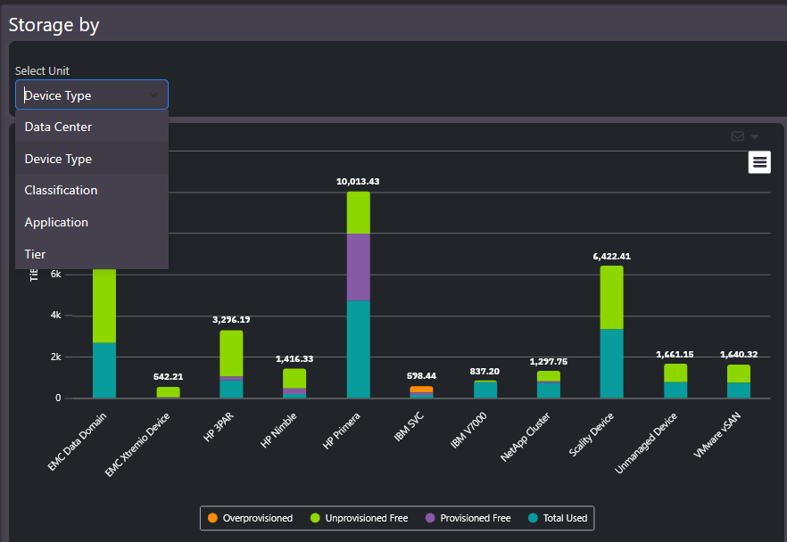
Storage by Group is the executive summary chart. Pick a grouping and every group appears side by side with its capacity split into how it is actually deployed.
What this screen shows
Each bar is a group; the stacked segments show its capacity split:
- Total used: capacity actually consumed by data.
- Provisioned free: allocated to hosts but not yet written.
- Unprovisioned free: available and not yet allocated to anything.
- Overprovisioned: allocation promised beyond physical capacity.
The grouping selector, data center, device type, classification, application, or tier, reorganizes the whole chart in one click. The same data answers a platform question (which device types hold the most), an organizational question (which applications consume the most), and a lifecycle question (how capacity splits across tiers).
When to use it
Relative-size questions: where the capacity is, which platforms dominate, and how much of each group’s footprint is actually used versus provisioned and idle. Large unprovisioned free segments on expensive platforms are consolidation candidates. It also produces the one-slide storage summary for management reviews without manual chart building.
Related screens
Free Space by Group isolates just the free capacity by the same groupings. Storage Environment shows the same estate as a health-colored heat map.