

Trends
Capacity and performance over time, at any grouping level, with burn-down tracking for migrations.
Trends answers whether growth is happening where you expect it. Capacity and performance are both plotted over time, and both can be grouped by data center, device group, classification, or application, not just by device. That grouping flexibility is what turns the chart from a graph into a plan check.
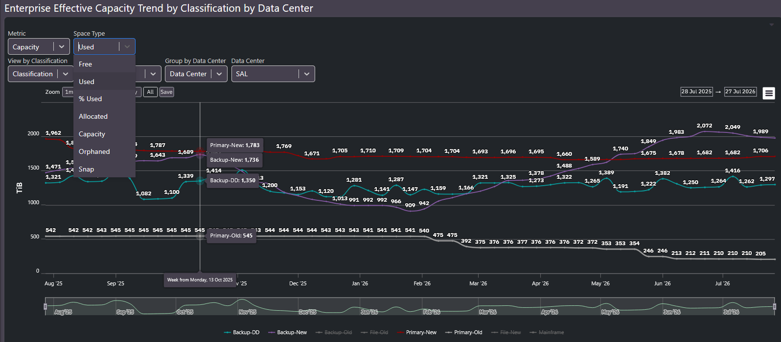
Capacity trends
The selectors control what is plotted:
| Selector | Options |
|---|---|
| Metric | Capacity or performance |
| Space type | Used, free, percent used, allocated, capacity, orphaned, snap |
| Group by | Data center, device group, classification, application |
| Window | Preset ranges from one month to all history, or custom dates |
Group the trend by classification and the burn-down pattern appears: primary-old declining as primary-new grows. If old storage is supposed to be draining and its line is flat, something still lives there, and the trend shows it long before the decommission date slips.
- Device-level trends show what each array is doing.
- Group-level trends, customizable to your own classifications, show whether the strategy is working. A backup storage group trending toward full is a purchase conversation worth having early, and this screen is where that trend becomes visible.
Performance trends
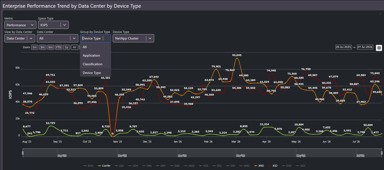
The same grouping logic applies to IOPS and latency. Compare device types within a data center, or the same classification across data centers, and seasonal patterns, growth in workload, and the effect of migrations all show up as line shape.
Tip: Define a primary-new versus primary-old classification for every environment you manage. The burn-down chart it produces is the single clearest view of whether a migration is actually finishing.
Related screens
For the exact change between two dates rather than the shape over time, use Delta Report. For where a trend ends up hitting a wall, use Enterprise Capacity Plan.